
Storage UI Survey

Storage UI Survey
Welcome to the Storage UI Survey! We are looking for your valuable feedback on our user interface designed for pickers and replenishment processes. Your input will help us enhance the overall experience and efficiency.
- Assess button and icon sizes
- Evaluate clarity of picking instructions
- Share your thoughts on visual themes
- Suggest improvements for a better user experience
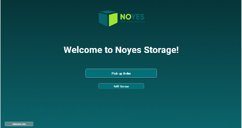
Home page - Are the buttons and icons sizes adequate for the screen
Yes clear enough
No should be bigger
No should be smaller
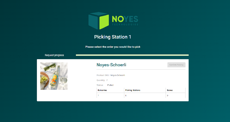
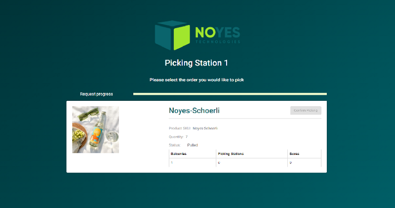
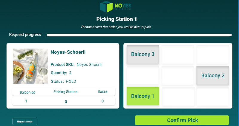
Does the following screen clearly display that the picker should pick up 7 bottles of Noyes-Schoerli from balcony 1?
Yes, clearly displayed
No, could be clearer
The "confirm button" still being greyed out means that the product is not yet on the balcony ,therefore not ready for pick. Once the product is on the balcony, the button will be enabled and the picking can start. Is this process straight forward for a Picker using this screen?
Yes, got it from looking at the screen
No, didn't get it without the explanation
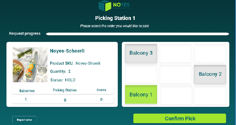
The section on the right aims to help the picker visualize the balcony repartition within the picking station. As a picker, is it clear that the product is on balcony 1 which is located on the left side of the first level?
Yes, it is clear and the map is very helpful
Yes, it is clear but the map is not that helpful
No, it is not understandable
Do the text fields and buttons need to be bigger?
Yes
No
If you have any comments on the sizes and repartition of the elements in the previous screen please write them below
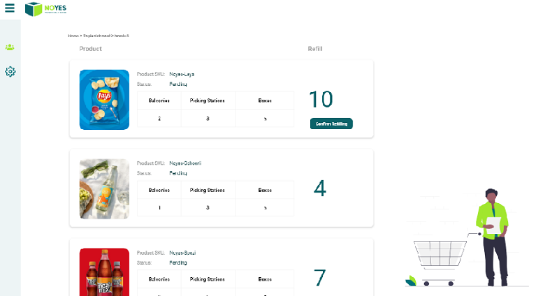
The following screen represents the order overview page for the replenishment process within the Storage UI. Are the product SKU, status and balconies text fields too small in comparison with the quantity to be refilled?
Yes, inconsistent
No, the quantity to be refilled should be the biggest and the rest is clear
I didn't know this was the quantity to be refilled
Are the background colors and themes of picking pages and refilling pages inconsistent?
Yes, it is too diffrent
No, helps differentiate between the two processes
If yes, which theme is nicer to adopt for the storage UI?
Dark mode - dark green background (picking)
Light mode - white background (refilling)
Do the colors and designs of the storage UI respect the Noyes Identity?
Yes
No
Should there be more instructions on each page?
Yes
No, the picker doesn't have time to read a lot
{"name":"Storage UI Survey", "url":"https://www.quiz-maker.com/QPREVIEW","txt":"Welcome to the Storage UI Survey! We are looking for your valuable feedback on our user interface designed for pickers and replenishment processes. Your input will help us enhance the overall experience and efficiency.Assess button and icon sizesEvaluate clarity of picking instructionsShare your thoughts on visual themesSuggest improvements for a better user experience","img":"https:/images/course4.png"}
More Surveys
Spotify Survey
12613
Is my website easy to use?
428
App survey
5220
Design change
3234
Evaluation survey for G1
630
Ecolog New Website
14717
Logo preference
4231
New 3B design- Please read option descriptions
4230
What do you think of this logo?
12612
Zanifu Ltd
1587
TREX User Acceptance Testing
5224
Paytm Insider Survey
14721