
Key Takeaways
- Start with a decision, not a dataset: Translate your business question into measurable variables and a small set of planned comparisons before you calculate anything.
- Clean data is analysis: Document missing values, outliers, duplicate responses, and suspicious patterns (straightlining, speeders) to avoid confident-but-wrong results.
- Descriptive first, inferential second: Use distributions, cross-tabs, and trends to understand what happened; use tests and confidence intervals to judge whether differences are likely real.
- Match method to variable type: Counts and categories use rates and cross-tabs; ratings use distributions and top-box; continuous measures enable correlation and regression.
- Report uncertainty and impact: Prefer effect sizes and confidence intervals over p-values alone, and connect results to an action threshold (what change would you act on?).
What quantitative data analysis is (and what it is not)
Quantitative data analysis is the process of turning numbers into answers: you summarize, compare, and model numeric patterns so you can make (and justify) decisions. In surveys and business datasets, that usually means converting responses into variables, checking data quality, and using statistics to describe results and estimate uncertainty.
It is not just calculating averages. Good quantitative analysis also includes: defining the question, deciding what would count as a meaningful change, verifying data quality, and communicating results in a way that supports action.
Quantitative analysis answers "how many", "how much", and "how different". When you need "why", you usually add qualitative evidence (open-ends, interviews) alongside the numbers.
Quantitative vs qualitative: when to use each
Use quantitative analysis when you need to measure magnitude, compare groups, or track change over time. Use qualitative analysis when you need to understand meaning, motivations, and the context behind a pattern.
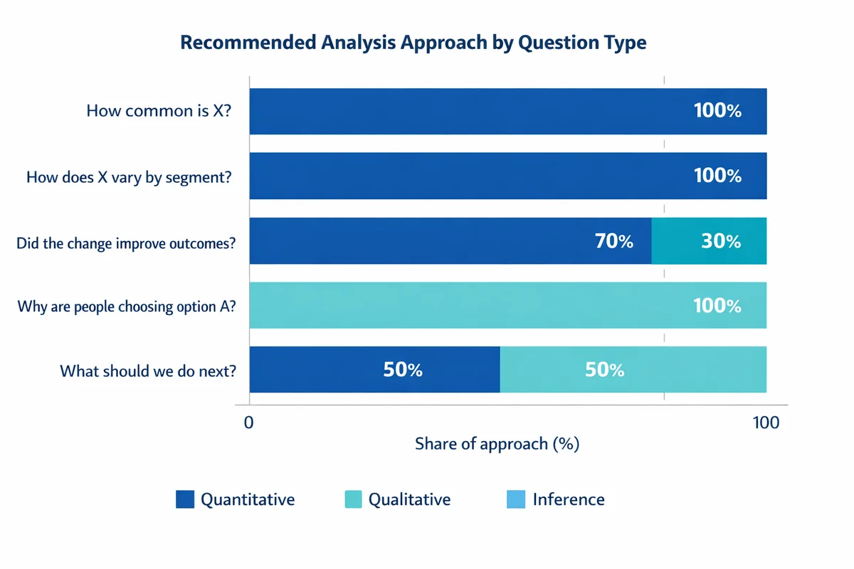
| Your question | Best fit | Example (survey/business) |
|---|---|---|
| How common is X? | Quantitative | % customers who experienced an issue last month |
| How does X vary by segment? | Quantitative | Compare satisfaction by region or role using cross-tabs |
| Did the change improve outcomes? | Quantitative + inference | Before/after comparison with uncertainty (CI) |
| Why are people choosing option A? | Qualitative (then quantify themes) | Open-ended follow-up on the biggest driver |
| What should we do next? | Combine both | Numbers show where; qualitative explains why |
If you are planning a survey, analysis quality starts at question design. Measurement errors (leading wording, unclear response options) become analysis problems later. See write better survey questions for common pitfalls and fixes.
A practical workflow you can repeat
Most competitive guides stop at "collect, clean, analyze, visualize". That is directionally right, but it misses what practitioners actually need: a workflow that starts with the decision and ends with a clear recommendation.
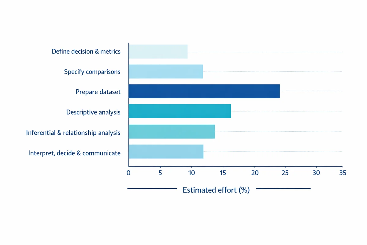
Define the decision and metrics
Write a one-sentence decision ("Should we roll out the new onboarding?") and 1-3 measurable outcomes (e.g., satisfaction, task success, retention). If you are doing formal research, start with research design basics and turn questions into measurable variables.
Specify comparisons up front
List the groups, time periods, or conditions you will compare (e.g., new vs old process; Region A vs B). Pre-specifying prevents cherry-picking later.
Prepare the dataset
Standardize coding, handle missing data, validate ranges, and remove duplicates. This is where most survey projects win or lose credibility.
Descriptive analysis
Summarize distributions, response rates, and key segments. Use charts that reveal shape (not just a single average).
Inferential and relationship analysis
When you need to generalize beyond your sample, quantify uncertainty using confidence intervals and significance testing. When you need to understand drivers, use correlation or regression (carefully).
Interpret, decide, and communicate
Translate results into a recommendation, including impact, uncertainty, and constraints. Build a survey results dashboard or a one-page brief for stakeholders.
This workflow aligns with how quantitative research methods are typically taught: clear operational definitions, careful data handling, and transparent reporting of uncertainty and limitations (see the open textbook by Davies for a plain-language overview: A quick guide to quantitative research in the social sciences).
Prepare and clean your data (survey-focused)
Before analysis, confirm what your variables mean and how they are coded. For survey work, your preparation plan should cover types of data (nominal, ordinal, interval/ratio), missing values, and potential low-quality responses.
If you need a refresher on what counts as quantitative survey data and how to structure it, start with types of survey data and prepare your dataset.
1) Build a codebook
A codebook is a simple dictionary that states: variable name, question text, response options, and coding rules. It prevents errors like treating "Prefer not to say" as a number or mixing 1-5 and 0-10 scales in the same analysis.
2) Handle missing data intentionally
- Separate true missing from skip logic: A blank from a conditional question is different from nonresponse.
- Avoid silent imputation: Do not replace missing values with 0 unless 0 is a valid value.
- Report denominators: For each metric, state the N actually used.
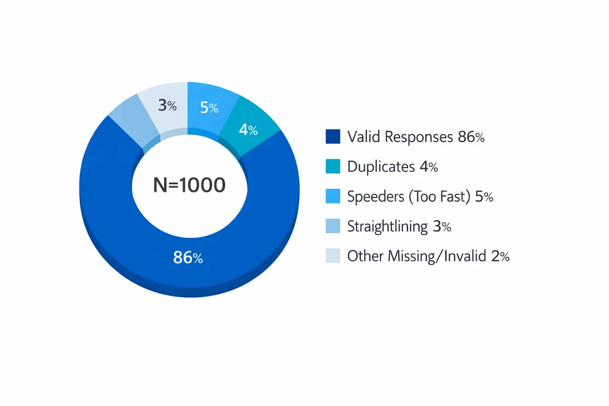
3) Check for low-quality responses and bias risks
Survey datasets often include careless responses (straightlining on grids, impossible patterns, duplicate submissions, or extremely fast completion). These can shift means and inflate correlations. Also consider who is missing from your dataset: nonresponse and self-selection can distort conclusions.
For common threats and mitigations, see response bias in surveys. If you need to justify quality safeguards, statistical agencies emphasize documented quality practices and transparent reporting (see National Academies guidance: Principles and practices for a federal statistical agency).
Descriptive analysis: summarize what happened
Descriptive statistics describe your sample: what responses you received, how they are distributed, and where the biggest differences appear. In survey work, this is where you usually deliver 80% of the business value.
Common descriptive outputs for surveys
- Response distributions: % choosing each option (more informative than a single average).
- Top-box / top-2 box: % selecting the highest category (common for satisfaction and agreement items).
- Central tendency: median and mean (with care for ordinal scales).
- Spread: standard deviation (for continuous measures) or interquartile range (for skewed ratings).
- Cross-tabs: compare distributions by segment (role, region, tenure).
- Trends: weekly/monthly movement with consistent definitions.
How to summarize Likert-type questions
Likert-type items (e.g., 1-5 Strongly disagree to Strongly agree) are ordinal: the order is meaningful, and the spacing is assumed but not guaranteed. In practice, teams often compute means for convenience, but you should also show distributions and/or top-box to preserve interpretability.
For common approaches (means, medians, distributions, and top-box), see Likert scale analysis.
Segmentation without misleading yourself
Segmenting results (by demographics, customer type, product tier) is often the fastest way to find actionable differences. The risk is over-interpreting small subgroups.
When segmenting, prefer:
- Pre-defined segments (based on your decision), not dozens of exploratory cuts.
- Minimum N thresholds per segment (e.g., do not act on N<30 without strong caveats).
- Reporting subgroup N and uncertainty (confidence intervals).
For demographic best practices, see demographic questions and tips for segmenting results by demographics.
Inferential analysis: test differences and relationships
Inferential statistics help you generalize beyond your collected responses. Instead of only saying "Group A scored higher", you estimate how much higher it might be in the broader population and how confident you are.
This is where sampling and sample size matter. If your sample is not representative, or if it is too small, your estimates can be unstable.
- sampling methods affect generalizability (who your results apply to).
- how many responses you need affects precision and the ability to detect meaningful differences.
Significance, confidence intervals, and effect sizes
A p-value answers a narrow question: if there were truly no difference, how surprising would this result be? It does not tell you whether the difference is important. Confidence intervals (CIs) are often more decision-friendly because they show a plausible range for the true value.
If you need a plain-language primer on how to interpret p-values and CIs without overclaiming, see statistical significance explained (including how to report uncertainty).
Relationships: correlation and regression
When you want to understand how two numeric variables move together, start with correlation. When you want to predict an outcome while accounting for multiple inputs, use regression.
- correlation vs causation: correlation can support hypotheses, but it does not prove cause.
- regression analysis basics: regression estimates associations while holding other variables constant, but it still relies on strong assumptions.
Use inference to decide if a difference is likely real; use effect size to decide if it is worth acting on; use domain context to decide what action is feasible.
Worked example: from raw survey export to a decision
Scenario: you ran a post-purchase survey to evaluate a new checkout experience. Leadership needs to decide whether to roll it out to all traffic.
The dataset (simplified)
You have 200 completed surveys:
- Experience: Old checkout (n=100) vs New checkout (n=100)
- Overall satisfaction (SAT): 1-5 rating
- Ease of checkout (EASE): 1-5 rating
- Issue encountered: Yes/No
- Device: Desktop/Mobile
Step A: Clean and code
- Confirm SAT and EASE are coded 1-5 consistently (no reversed items).
- Standardize device labels (e.g., "mobile", "Mobile", "MOBILE" -> "Mobile").
- Set missing values explicitly (blank -> NA) and track N per metric.
- Run basic quality checks: duplicates by respondent ID, completion time outliers, straightlining if you used grids.
Tip: if you discover recurring measurement issues, fix the instrument before the next wave. Analysis cannot rescue ambiguous questions. (See avoid measurement errors.)
Step B: Describe results (distributions first)
Rather than jumping straight to an average, start with a top-2 box metric: SAT 4-5 indicates a satisfied customer.
| Group | n | SAT 4-5 count | SAT 4-5 % |
|---|---|---|---|
| Old checkout | 100 | 48 | 48% |
| New checkout | 100 | 62 | 62% |
On its face, the new checkout looks better (+14 percentage points). The next question is: is +14 likely to persist beyond this sample?
Step C: Add uncertainty (difference in proportions with a 95% CI)
Compute the difference in satisfied rate: 0.62 - 0.48 = 0.14.
Standard error (SE) for the difference in two independent proportions is:
SE = sqrt(p1(1-p1)/n1 + p2(1-p2)/n2)
Plugging in values (p1=0.62, n1=100; p2=0.48, n2=100) gives SE about 0.0696. A 95% CI is:
0.14 +/- 1.96 * 0.0696 = [0.003, 0.277]
Interpretation for a decision-maker:
- Best estimate: the new checkout improves satisfied rate by about 14 points.
- Plausible range: the true lift could be as low as near 0 or as high as ~28 points.
- Action framing: if you require at least a 5-point lift to justify rollout, this result is promising but close to the margin on the low end. You might run a larger sample (or extend the test period) to tighten the CI.
If you prefer hypothesis testing, the corresponding z-test yields p about 0.044 (barely under 0.05). Do not treat that threshold as magic; use it as one input alongside impact and risk. (See p-values and confidence intervals.)
Step D: Segment to find where it works (and where it breaks)
Now split by device to see if the lift is concentrated on desktop or mobile. This is where segmenting results by demographics (and other attributes) becomes operationally useful.
- If lift is only on Desktop, you might hold rollout until mobile issues are fixed.
- If lift is strong on both, rollout is less risky.
Guardrails:
- Report N per segment.
- Avoid overreacting to tiny segments.
- If you look at many segments, expect some "significant" differences by chance. Pre-plan key cuts.
Step E: Explore drivers (correlation, then regression)
Suppose you find EASE and SAT move together strongly in your sample. A correlation can quantify that association, but it does not prove that improving EASE causes SAT to rise (there may be confounders, and both could be driven by a third factor).
Use correlation for a first pass, then consider a regression model when you want to estimate the association while controlling for other factors (e.g., device, issues encountered). For interpretive guardrails, review correlational analysis and predicting outcomes from survey data.
Step F: Turn analysis into a recommendation
A decision-ready summary might look like this:
- Result: New checkout increased SAT top-2 box from 48% to 62% (difference 14 points; 95% CI ~0 to 28).
- Risk: Uncertainty is wide; confirm with more data and verify no sampling imbalance.
- Next action: Extend the experiment to reach the planned sample size threshold, and prioritize fixes in segments where lift is weakest.
Choose the right method fast (a decision guide)
Pick the simplest method that answers your question with acceptable risk. The table below is a practical starting point for surveys and common business datasets.
| What you need to know | Typical variables | Go-to methods | What to report |
|---|---|---|---|
| How many / how often? | Counts, categories | Frequencies, rates, response distributions | % with denominator (N), trend over time |
| Are groups different? | Binary outcome, rating, numeric | Cross-tabs; difference in means/proportions; chi-square / t-test (as appropriate) | Difference + 95% CI; effect size; segment N |
| Is there a relationship? | Two numeric (or numeric + ordinal) | Scatterplots; correlation; rank correlation for ordinal | Correlation with context and limitations |
| What predicts an outcome? | One outcome, multiple inputs | Regression (linear/logistic), with diagnostics | Key coefficients, model fit, assumptions, practical impact |
| Where should we intervene? | Segments + outcomes | Driver analysis + segmentation; targeted experiments | Prioritized opportunities with expected impact |
A quick checklist before you run any test
- Sampling plan: Who does the sample represent? (See who to survey.)
- Sample size and stability: Is N large enough for the minimum effect you care about? (See sample size guidance.)
- Multiple comparisons: Did you test many segments/outcomes? If yes, interpret cautiously and prioritize pre-planned comparisons.
- Measurement quality: Are you confident the question measures what you think it measures? (See write better survey questions.)
Reporting and visualization that leads to action
Analysis only matters if stakeholders can understand and use it. Your goal is not to show every chart; it is to show the smallest set of outputs that supports a decision.
Charts that work well for survey results
- Likert distributions: stacked bars (100% stacked) or side-by-side bars for key groups.
- Trends: line charts with consistent definitions and annotated changes (policy changes, releases).
- Group comparisons: dot plots with confidence intervals (more honest than bar charts alone).
- Drivers: scatterplots (SAT vs EASE) plus a simple fitted line (with caveats).
Build a decision-ready dashboard
A good dashboard answers three questions: (1) what is happening, (2) where is it happening, and (3) what should we do next? If you are packaging results for ongoing monitoring, start with a visualize and share results layout that includes: headline metrics, key segments, trends, and a notes area for methodology and caveats.
Tool-agnostic guidance: Excel vs stats software
You can do credible quantitative analysis in spreadsheets for small-to-medium survey datasets. As complexity grows (more variables, more segments, repeated measures, weighting, modeling), you will usually want statistical software or code-based workflows.
| Tool | Best for | Watch-outs |
|---|---|---|
| Excel / Google Sheets | Cleaning small exports, pivot tables, basic charts, simple tests | Easy to make silent errors; reproducibility is harder; limited modeling |
| SPSS / Stata / similar | Survey-weighted analysis, standard tests, auditability | License cost; still requires methodological choices |
| R / Python | Reproducible workflows, automation, advanced modeling, version control | Higher learning curve; requires coding standards |
| BI tools (Power BI/Tableau/etc.) | Dashboards, interactive filtering, ongoing reporting | Not a substitute for careful statistical design; modeling may be limited |
One last quality note: document assumptions
When results will drive high-stakes decisions, document your choices: exclusions, missing data handling, segment definitions, and which tests you ran. More advanced approaches like quantitative bias analysis exist for assessing potential bias under assumptions, especially in observational settings (see the systematic review by Shi et al.: Quantitative bias analysis methods... A systematic review). You do not need to run those methods for every survey, but you should acknowledge plausible bias risks.
References
- Davies, C. (2020). A quick guide to quantitative research in the social sciences. University of Wales Trinity Saint David (Open textbook).
- National Academies of Sciences, Engineering, and Medicine. (2021). Principles and practices for a federal statistical agency (7th ed.). The National Academies Press (Chapter 24).
- Callaghan, P., & Bee, P. (2018). Quantitative data analysis. In A research handbook for patient and public involvement researchers. Manchester University Press.
- Shi, X., Liu, Z., Zhang, M., Hua, W., Li, J., Lee, J.-Y., Dharmarajan, S., Nyhan, K., Naimi, A., Lash, T. L., Jeffery, M. M., Ross, J. S., Liew, Z., & Wallach, J. D. (2024). Quantitative bias analysis methods for summary-level epidemiologic data in the peer-reviewed literature: A systematic review. Journal of Clinical Epidemiology, 175, 111507.
- Jenkins-Smith, H., & Ripberger, J. (2017). Quantitative research methods for political science, public policy and public administration (with applications in R) (3rd ed.). University of Oklahoma Libraries (Open textbook).
Frequently Asked Questions
Can I average Likert scale responses?
You can, but do not stop there. Likert-type responses are ordinal, so a mean can hide important distribution differences (e.g., polarization). Pair any mean with the full distribution and/or top-box metrics. For survey-specific guidance, see Likert scale analysis.
Do I need statistical significance (p-values) to make decisions?
Not always. If you have the full population (e.g., all transactions), descriptive analysis may be enough. If you are using a sample to generalize, confidence intervals and planned tests help quantify uncertainty. Use p-values as one input, not the whole decision. See statistical significance explained.
What is the difference between correlation and causation?
Correlation means two variables move together; causation means changing one produces a change in the other. Surveys often reveal correlations, but confounding and selection effects can create relationships that are not causal. See correlation vs causation for interpretation guardrails.
How many survey responses do I need for quantitative analysis?
It depends on (1) how precise you need to be, (2) how many segments you will compare, and (3) the minimum effect you would act on. Use how many responses you need as a starting point, then plan for subgroup Ns if segmentation is central to the decision.
What are the most common data quality problems in surveys?
Typical problems include careless responding (straightlining), duplicates, missing values, inconsistent coding, and selection/nonresponse bias. Build checks into your pipeline and document exclusions. See sources of bias to watch for.