
Key Takeaways
- Match the scale to the decision: Use numeric (0-10) for tracking, labeled verbal scales for clarity, and stars/faces for fast, low-effort feedback.
- Decide points and labels intentionally: 5-point scales are usually easiest; 7-point can add sensitivity for tracking; fully label endpoints at minimum (and preferably every option).
- Write the question first, then the scale: Keep one idea per item, define the timeframe, and keep the direction consistent across the survey.
- Plan for bias and noise: Watch for acquiescence, extreme responding, and midpoint use; reduce them with balanced labels, clear anchors, and thoughtful midpoint choices.
- Report more than the average: Show distributions, top-box/bottom-box, and changes over time; add an open-ended questions follow-up to capture the "why" behind the rating.
Rating questions are the workhorse of customer, employee, and product feedback. They are quick to answer, easy to quantify, and simple to trend over time. But small design choices (how many points, how you label them, whether you include a midpoint) can change what people select and how confidently you can interpret the results.
This guide walks through the most common formats, shows wording examples you can copy, and covers the practical tradeoffs: when to use a rating scale, when not to, how to reduce common errors, and how to report ratings so stakeholders do not overreact to a single number.
What are rating scale survey questions?
Rating scale questions ask respondents to evaluate a single thing (a product, experience, statement, or attribute) by selecting a point on a defined scale. The scale might be numbers (1-5, 0-10), words (Poor to Excellent), stars, faces, or a slider.
In most surveys, rating scales are used to measure perceptions (satisfaction, agreement, ease, quality) rather than facts. You can analyze rating results as distributions (how many chose each option), summaries (top-box), or trends (change from last quarter).
A rating scale turns a subjective judgment into an ordered choice set. Your job is to make that choice set unambiguous and consistent so differences reflect opinions, not confusion.
Rating vs ranking: do not mix them up
Rating means each item is judged independently ("Rate each feature"). Ranking forces tradeoffs ("Order these features from most to least important").
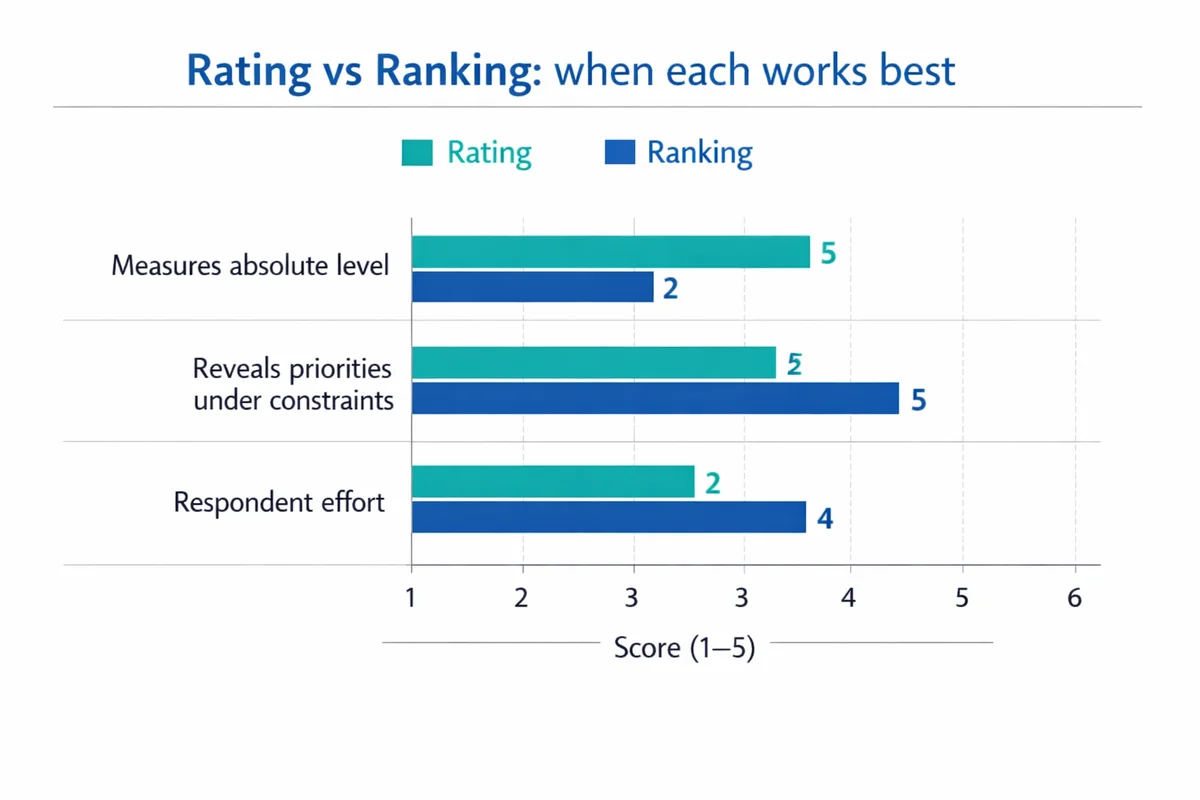
Use rating when you need absolute levels ("How satisfied are you?") or when many items could legitimately score high. Use ranking when you must understand priorities under constraints (budget, roadmap, staffing).
- Choose rating when: You need to track a single metric over time (e.g., CSAT) or compare segments.
- Choose ranking when: You need a forced order of importance or preference and can tolerate more respondent effort.
Common rating scale types (with when to use each)
Most rating questions fall into a handful of formats. The best choice depends on your audience, device (mobile vs desktop), and how you plan to report results.
| Scale format | What it looks like | Best for | Watch-outs |
|---|---|---|---|
| Numeric points | 0-10, 1-5, 1-7 | Benchmarking, trend tracking, dashboards | Unlabeled numbers can be interpreted differently across respondents |
| Verbal (worded) points | Poor, Fair, Good, Very good, Excellent | Clarity for broad audiences; employee and citizen surveys | Wording must be balanced; avoid gaps (e.g., two "good" options) |
| Likert (agreement) | Strongly disagree to Strongly agree | Attitudes toward statements; scale indexes | Agreement wording can trigger acquiescence (yea-saying) |
| Stars / faces | 1-5 stars; 5 faces from unhappy to happy | Fast post-interaction feedback, kiosks, low literacy contexts | Less precise; may feel more "app-like" than "survey-like" in serious contexts |
| Slider (continuous) | Drag a handle along a line | When you truly need fine granularity and have UI control | Harder on mobile; higher measurement noise; avoid if precision is not necessary |
Numeric rating scales (1-5, 0-10)
Numeric scales are compact and easy to compute. The tradeoff is interpretation: one person may treat a 7/10 as "pretty good" while another sees it as "barely acceptable". If you use numbers, anchor them with meaning.
Example: "How satisfied were you with your support interaction today?"
- 0 = Not at all satisfied
- 10 = Extremely satisfied
Verbal (word-labeled) rating scales
Worded options reduce interpretation drift and are often more accessible. Research comparing response scales shows that design choices can affect how responses distribute across the scale, including use of midpoints and extremes, so clarity in labels matters for comparability over time.(Rezende et al., 2022)
Example: "Overall, how would you rate the quality of the training?"
- Poor
- Fair
- Good
- Very good
- Excellent
Likert scale questions (agreement scales)
A Likert item is typically a statement rated from disagree to agree. People often say "Likert" when they mean any rating scale, but agreement scales are only one subtype. If you are building an attitude battery, read our guide to Likert scale questions and the practical differences in Likert vs rating scale formats.
Example (agreement): "The onboarding materials prepared me for my first week."
- Strongly disagree
- Disagree
- Neither agree nor disagree
- Agree
- Strongly agree
When to avoid agreement wording: If your stakeholders only care about the attribute (clarity, usefulness, ease), direct rating is often clearer than agree/disagree because it keeps the question and options aligned (e.g., "How clear were the onboarding materials?").
Stars, faces, and other graphical scales
Graphic scales are fast and familiar. Use them when the context is lightweight (post-purchase, in-app, kiosk). If you need defensible reporting to leadership, consider pairing the graphic with a labeled numeric or verbal scale for clarity.
Example (5-star): "How would you rate this article?" (1 to 5 stars)
Sliders (continuous scales)
Sliders can look modern, but they introduce extra interaction cost. Some respondents will leave the handle at the default position, and small finger movements on mobile can create noisy variation. If you do use a slider, show numeric ticks or endpoints, and consider snapping to discrete values (e.g., 0-10) rather than truly continuous input.
How to choose scale length and labels
The most common design decision is the number of points. There is no universal "best" scale, but there are predictable tradeoffs.
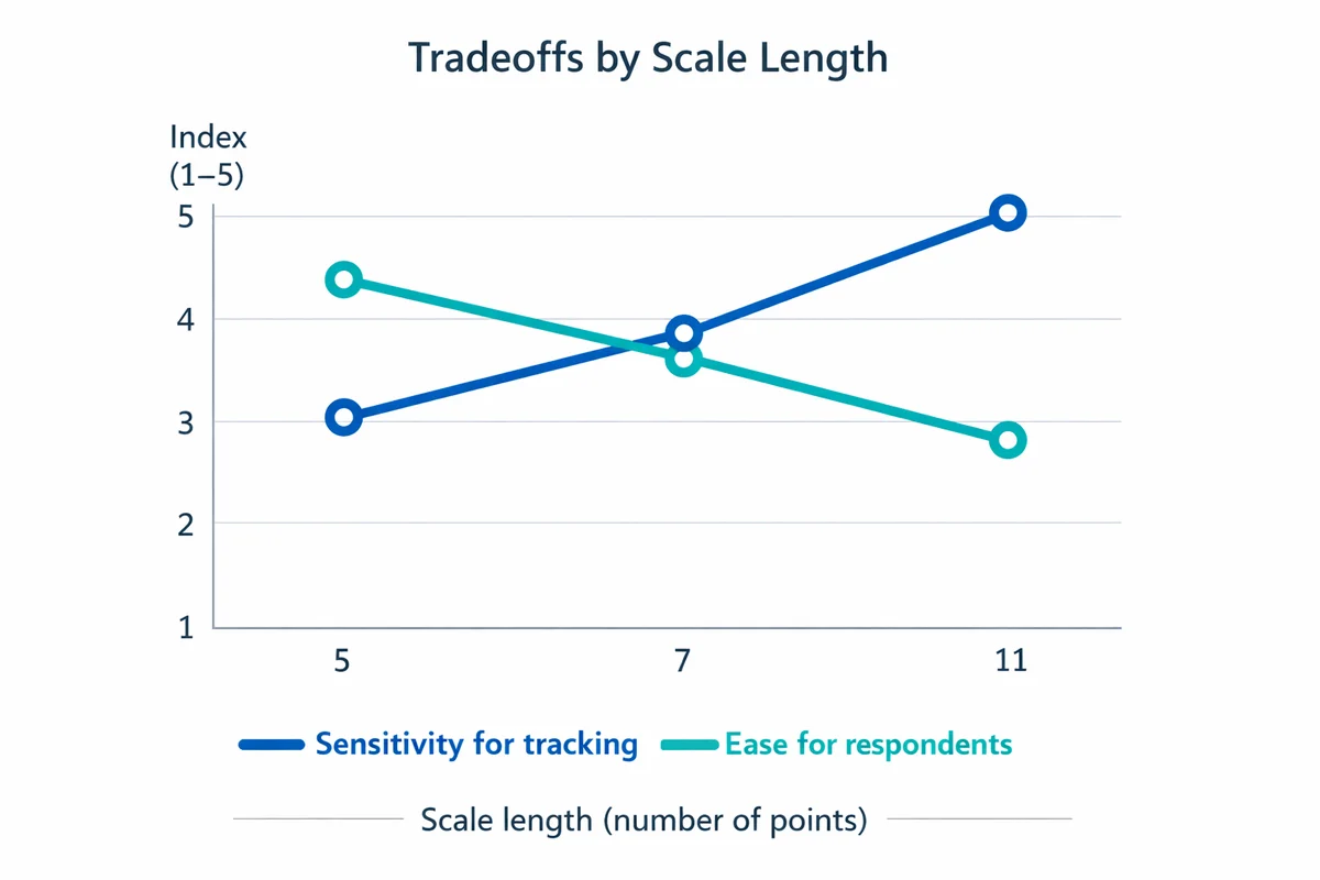
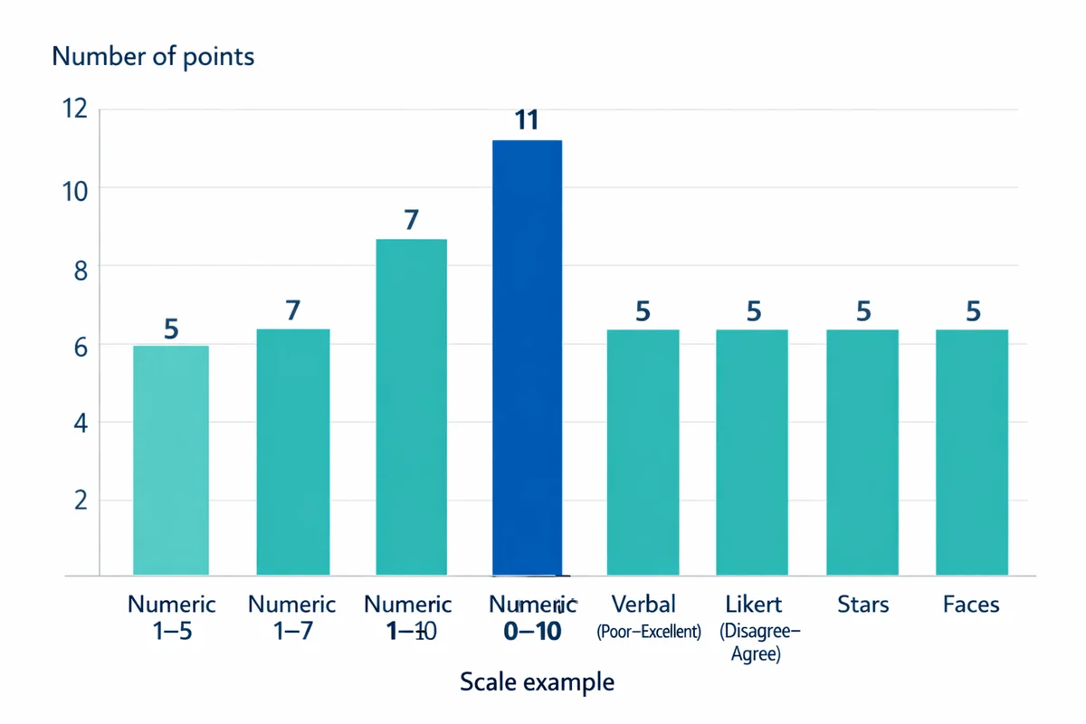
5-point vs 7-point vs 10-point
- 5-point: Easiest for respondents; good default for satisfaction and quality ratings; works well on mobile.
- 7-point: Adds sensitivity (more spread) for tracking small changes, but may increase inconsistency if labels are weak.
- 10- or 11-point: Useful for dashboards and certain established metrics, but requires strong anchoring and consistent interpretation. Consider labeling at least the endpoints, and ideally more points.
Empirical comparisons show that changing response scale formats can alter response patterns and measurement properties, so if you care about trending, lock your scale early and keep it stable across waves.(Dell-Kuster et al., 2014)
Should you label every point?
Label endpoints at minimum. Fully labeling all points tends to improve clarity (respondents know what each choice means) and reduces "guessing" about what the middle values represent.
If you cannot label every point (common with 0-10), label more than just the ends when possible (e.g., 0, 5, 10) and define what higher scores mean in the question prompt.
Do you need a neutral midpoint?
Midpoints can mean different things: neutral, unsure, not applicable, or "no opinion". Do not overload one option.
- Include a midpoint when neutrality is a meaningful stance ("Neither satisfied nor dissatisfied") or when forced choice would create random answers.
- Remove the midpoint when you must force direction for a decision (e.g., a quick pulse where "leaning" matters). If you remove it, consider adding a separate "Not applicable" option when relevant.
Studies of rating scales show that midpoint availability and scale design can influence preferences for middle and extreme points.(Rezende et al., 2022)
How to write clearer rating questions (with copy-ready templates)
Good scales cannot fix unclear questions. If you want a deeper set of rules and examples, see how to write survey questions.
Define the object and timeframe
What exactly is being rated, and over what period? "This visit" and "the last 30 days" produce different answers.
Choose one concept per question
Avoid double-barreled items like "How satisfied are you with speed and friendliness?" Split into two ratings.
Match the scale to the concept
Use satisfaction for experiences, ease for effort, quality for deliverables, likelihood for intent. Do not default everything to agreement scales.
Make direction consistent
Keep high numbers meaning "better" throughout the survey. Mixing directions increases error.
Add a follow-up "why" when you need actionability
Ratings tell you where; verbatims tell you why. Pair key ratings with an add an open text field follow-up.
Templates you can copy
- Satisfaction (CSAT): "Overall, how satisfied were you with [interaction/product] today?" (Very dissatisfied to Very satisfied). For more context, see customer satisfaction surveys.
- Ease (effort): "How easy was it to [complete task]?" (Very difficult to Very easy).
- Quality: "How would you rate the quality of [deliverable/service]?" (Poor to Excellent).
- Clarity: "How clear were the instructions you received?" (Not at all clear to Extremely clear).
- Confidence: "How confident are you that you can [do X] after this training?" (Not at all confident to Extremely confident).
If you see wide variance in interpretation, strengthen the anchors. Example: "0 = Did not solve my problem" and "10 = Completely solved my problem" is clearer than "0 = bad" and "10 = good".
Common rating scale biases and pitfalls (and how to reduce them)
Rating questions are vulnerable to systematic response patterns. These patterns are part of broader response bias issues: people try to be agreeable, rush, or interpret scales differently.
1) Acquiescence (yea-saying) in agreement scales
Respondents may select "Agree" as a default, especially on long batteries. Mitigations:
- Prefer direct attribute ratings (clarity, helpfulness, satisfaction) over agree/disagree when possible.
- If you must use agreement, keep statements simple and avoid leading language.
2) Extreme responding vs central tendency
Some people favor endpoints; others avoid them and cluster around the middle. Scale design influences midpoint and extreme use, and changes in design can shift results even if attitudes are stable.(Rezende et al., 2022)
Mitigations:
- Use clear, symmetric labels (balanced positive/negative).
- Decide on midpoint vs forced choice intentionally (do not switch between surveys if you trend results).
3) Unbalanced or overlapping labels
Avoid scales like "Good, Very good, Excellent, Outstanding" (all positive) unless the question is explicitly only about positive experiences. Overlap creates ambiguity and inflates top scores.
4) "Not applicable" hidden inside a midpoint
If some respondents cannot honestly rate (they did not use a feature), give them a separate escape option ("Not applicable" or "Did not use"). Do not make the midpoint do double duty.
5) Visual and device issues
Sliders and long horizontal scales can be hard on mobile. Follow general survey design best practices: short labels, large tap targets, and consistent layouts across questions.
- Consistency check: Keep the same number of points and label style for the same construct (e.g., all satisfaction items use the same 5-point labels).
- Direction check: Make sure higher always means more/better, and the positive label is on the same side each time.
- Escape hatch: Add "Not applicable" when a respondent may lack exposure.
When rating scales are the wrong tool (and what to use instead)
Rating scales measure perceptions. If the question is factual or categorical, a rating scale can produce meaningless noise.
Consider alternatives:
- Use multiple-choice questions for facts and categories (role, region, product tier, which feature used).
- Use a numeric entry for true quantities (number of days, dollars spent).
- Use ranking when prioritization matters more than absolute approval.
Common mismatch examples:
- Bad: "How much did you pay?" (1-5). Better: price ranges or numeric entry.
- Bad: "How often did you use Feature X?" (Poor to Excellent). Better: frequency options (Never, Once, Weekly, Daily).
How to analyze and report rating scale results
A single average can hide important shifts. Ratings are ordered categories, and treating them as fully precise measurements can lead to overconfident conclusions; many methodologists recommend reporting distributions and using summaries that fit your decision context.(Uher, 2018)
For a broader workflow, see how to analyze survey data.
1) Start with a distribution
Show how many respondents selected each option. This helps you spot polarization (many highs and lows) vs consensus (clustered responses).
2) Use top-box and bottom-box
Top-box is the percent in the highest category (or top two categories). It is easy to communicate and often more stable than a mean.
Example definitions (5-point satisfaction):
- Top-box: % "Very satisfied"
- Top-2 box: % "Satisfied" + % "Very satisfied"
- Bottom-2 box: % "Dissatisfied" + % "Very dissatisfied"
3) Compare segments carefully
Break out results by customer type, region, tenure, channel, or product plan. Use the same scale wording across segments. If your organization has formal information quality guidance, align reporting and interpretation to documented standards for accuracy and transparency.(U.S. General Services Administration, n.d.)
4) Track changes over time (but avoid "scale drift")
If you change labels, point counts, or midpoint options, you may change response behavior rather than underlying sentiment. If you must change the scale, treat it as a break in the trend and document it.
5) Add an open-ended follow-up to explain movement
When a metric moves, you need to know why. Pair one or two key ratings with a short follow-up:
- "What is the main reason for your score?"
- "What is one thing we could do to improve?"
This is where follow-up why question design pays off: short prompt, single text box, optional, and placed immediately after the rating.
Ready-to-use rating question examples (by scenario)
Use these as starting points, then adjust the timeframe, object, and labels to match your context.
Customer support (post-interaction)
- CSAT: "Overall, how satisfied were you with the support you received today?" (Very dissatisfied to Very satisfied)
- Resolution quality: "How well did we resolve your issue?" (Not at all to Completely)
- Speed: "How would you rate the speed of our response?" (Poor to Excellent)
For a plug-and-play starting point, use our customer satisfaction survey template.
Product feedback
- "How easy was it to complete [task] in the product?" (Very difficult to Very easy)
- "How would you rate the value you receive for the price you pay?" (Very poor value to Excellent value)
- "How confident are you that you could use this feature without help?" (Not at all confident to Extremely confident)
Employee experience
- "How supported do you feel by your manager this month?" (Not at all supported to Extremely supported)
- "How clear are your priorities for this week?" (Not at all clear to Extremely clear)
- "How satisfied are you with your workload?" (Very dissatisfied to Very satisfied)
Training and events
- "How would you rate the instructor's delivery?" (Poor to Excellent)
- "How relevant was the content to your role?" (Not at all relevant to Extremely relevant)
- "How likely are you to recommend this session to a colleague?" (0-10 with anchored endpoints)
If you run many surveys, standardize a few scales (e.g., 5-point satisfaction, 5-point ease, 0-10 likelihood) and reuse them. This improves comparability and reduces respondent confusion.
If you need more contexts (product, service, employee), browse our satisfaction survey templates.
References
- Rezende, N. A. de, Cabral, D. T., Moura, A. P., & de Almeida, S. O. (2022). How rating scales influence responses' reliability, extreme points, middle point and respondent's preferences. Journal of Business Research, 138, 266-274.
- Dell-Kuster, S., Sanjuan, E., Todorov, A., Weber, H., Heberer, M., & Rosenthal, R. (2014). Designing questionnaires: Healthcare survey to compare two different response scales. BMC Medical Research Methodology, 14, 96.
- Uher, J. (2018). Quantitative data from rating scales: An epistemological and methodological enquiry. Frontiers in Psychology, 9, 2599.
- U.S. General Services Administration. (n.d.). Data Quality Guidelines.
Frequently Asked Questions
Is a 5-point or 7-point rating scale better?
Use 5-point as the default when you want speed and clarity (especially on mobile). Use 7-point when you need a bit more sensitivity for tracking smaller changes over time and you can label options clearly. Avoid changing point counts mid-trend unless you are willing to treat it as a break in the time series.
Should I include a neutral midpoint?
Include a midpoint when neutrality is a real stance or when forcing direction would create random answers. Remove it only when you have a clear decision reason to force a lean. If "Not applicable" is likely, provide it separately rather than hiding it inside the midpoint.
Do I need to label every option on a numeric scale?
Label endpoints at minimum. If you can, label every point on shorter scales (like 5-point). On 0-10 scales, consider labeling at least 0, 5, and 10 and define what a high vs low score means in the question prompt.
Should I report the average rating?
Often you can, but do not stop there. Add the distribution (percent in each option) and a top-box measure (percent in the highest category, or top two). Averages can hide polarization or shifts between middle categories.
What is the difference between a Likert scale and a rating scale?
A Likert item is a specific type of rating scale that measures agreement with a statement (disagree to agree). "Rating scale" is the broader category that also includes satisfaction, quality, ease, stars, and other formats.