
Key takeaways
- Start from a decision, not a topic. Write down what you will do differently depending on the answers. Any item that cannot change a decision is a candidate for deletion.
- One idea, one item, one time frame. If a question hides two questions, you cannot tell which half drove the answer.
- Wording moves the numbers. One split-sample experiment moved support for the same government programs by 45 percentage points by renaming them, so neutral phrasing is a measurement choice and not a courtesy.
- Design the answer options as carefully as the question. Overlapping ranges, missing categories, and an unlabeled midpoint do more damage than an inelegant stem.
- Pretest with people, then pilot with data. A read-aloud with a handful of respondents finds the misreadings you cannot see from the writer's chair.
What questionnaire design is, and what it cannot fix
Questionnaire design is the process of turning a research objective into questions people can understand and answer accurately. It includes the wording, response options, order, introduction and testing. The seven steps below show how those choices work together in a complete questionnaire.
An item is well designed when two people with the same experience read it the same way, can retrieve the answer from memory, and pick the same option to describe it. Everything below is a way of getting closer to that.
Two things it cannot fix. It cannot fix the wrong audience: ask perfect questions of the wrong people and you get precise answers to a question nobody asked. That is a sampling problem, not a wording problem. It cannot fix too few responses either, which is a sample size problem.
It is also worth separating two words that get used interchangeably. The questionnaire is the instrument, the list of items and answer options. The survey is the whole study around it: who you ask, how you reach them, and what you do with the data. If you need the wider process, that is covered in our guide to survey research design. This page stays on the instrument.
The 7 steps of questionnaire design
Searchers ask for seven steps more than any other number, and the lists that come back are mostly copies of one 2006 agency blog post whose original page is no longer up. So the sequence below is not that list. It is the development process the survey methodology literature actually describes16, 17, 20, cut at the seven points where the work genuinely changes shape, with the two things those copies leave out: what each step produces, and where each one usually fails.
| Step | What you decide | What you produce | Where it usually fails |
|---|---|---|---|
| 1. Decisions first | What the results have to decide | A short list of decisions and the comparisons behind them | Starting from a topic, so nothing tells you when to stop adding items |
| 2. Items and formats | One item per decision, and its answer format | A draft item list with a format beside each one | Picking the format by habit rather than by the analysis you need |
| 3. Answerable wording | How each stem is phrased | Stems with defined terms and a stated time frame | Asking for recall nobody has, or hiding two questions in one |
| 4. Options and scales | The answer set for every closed item | Options that do not overlap and leave nobody stranded | Overlapping ranges, no escape option, an unlabeled midpoint |
| 5. Neutral wording | Which words are pushing an answer | Neutral stems and balanced option sets | Adjectives in the stem, and one-sided answer lists |
| 6. Order and intro | Sequence, grouping, and the opening text | An ordered instrument with a short introduction | Sensitive items too early, and an introduction nobody reads |
| 7. Pretest and pilot | Whether it works on real people | A revised instrument and a timing estimate | Skipping it, or treating one round as enough |
Steps 3, 4 and 5 are separated here because they fail in different ways and get fixed by different moves. In practice you will loop through them more than once. The dashed line in the diagram is the loop that matters most: what the pretest finds usually sends you back to step 3.
Step 1. Write the decisions down before you write a single question
Most bloated questionnaires start from a topic. Good ones start from a decision. Before you draft an item, write the short list of things you will do differently depending on what comes back.
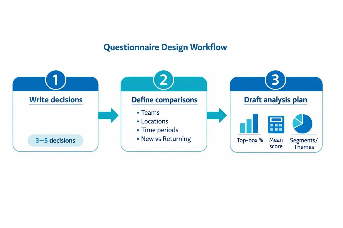
List three to five decisions
Write them as choices, not themes. "Repeat the two-day format or switch to short online sessions" is a decision. "Training feedback" is a theme.
Name the comparisons you must make
Teams, sites, shifts, time periods, first-time versus returning. Comparisons drive both the wording and the answer options, so decide them now rather than later.
Draft the outputs on one page
Sketch the actual tables and charts you expect to make. If you cannot draw the output an item feeds, that item has no job.
This is the step the methodology guides put first, and for the same reason: it is the only thing that tells you when to stop adding questions.16, 17
Read each draft item and finish this sentence: "If everyone answers B instead of A, we will ..." If you cannot finish it, cut the item or rewrite it until you can.
Step 2. Turn each decision into one item, and choose its format on purpose
Question format is a measurement decision, not a layout preference. Pick the format that the reader can answer and that your planned output can use.
| If the output is | Use | Example stem |
|---|---|---|
| A number you will track over time | A closed rating item, fully labeled | "How easy or difficult was it to complete setup without help?" |
| A ranked list of things to fix | Single choice, then one follow-up | "Which one change would help you most?" then "Why that one?" |
| A count or a rate | Closed ranges that do not overlap | "In the past 30 days, how many times did you contact support?" |
| Language you have not heard yet | One targeted open text box | "What was the main reason you got in touch today?" |
| Eligibility for later items | A screener plus skip logic | "Have you used the reporting tab in the past 30 days?" |
Closed items are cheaper to analyze and easier to compare across waves. Open items find the things your option list forgot. The practical reason closed items dominate is cost: open answers need a coding scheme and more than one coder before they mean anything.1 Use one or two open items, placed where they earn their keep, and keep the rest closed. Our guides to multiple choice questions and open-ended and closed-ended questions go deeper on each format.
One warning about agreement scales. If you can ask the thing directly, ask it directly. In a four-sample experiment, items with construct-specific answer options reached reliability coefficients of 0.87 to 0.93, while the same content asked as agree or disagree statements reached only 0.36 to 0.73.4 That is a large gap for a format most people choose out of habit. Two named response effects account for much of it. Acquiescence is the pull towards agreeing whatever the statement happens to say, so the format adds a lean you cannot separate out afterwards. Satisficing is the reader doing just enough work to produce an answer that will pass rather than one that is accurate, and a column of agree or disagree statements makes that very cheap to do. Both get worse as the questionnaire gets longer. If you do need the format, follow our Likert scale guidance.
Step 3. Write a stem people can actually answer
Many bad items are not vague. They are unanswerable. They ask for recall nobody has, or for knowledge the respondent was never given.
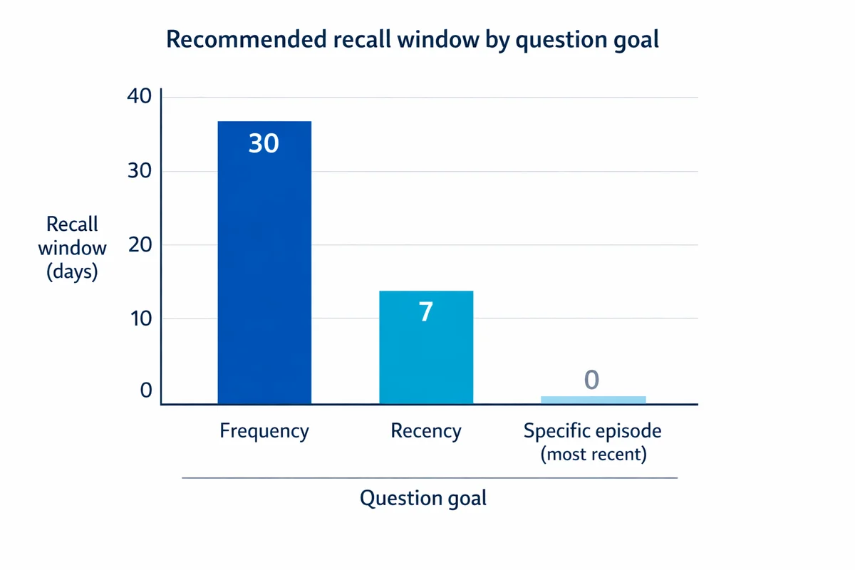
Give every behavior question a time window
"How often do you contact support?" has no anchor, so two people with identical behavior will answer differently. Name the window, and match it to how often the behavior happens.
| You want | Hard to answer | Answerable |
|---|---|---|
| A frequency | "How often do you contact support?" | "In the past 30 days, how many times did you contact support?" |
| A recent behavior | "Do you exercise regularly?" | "In the past 7 days, on how many days did you do at least 30 minutes of exercise?" |
| One episode | "Was onboarding smooth?" | "Thinking about your most recent setup, how easy or difficult was it to finish without help?" |
Use the words your readers use
- Pick the common word. "Help" beats "assistance". "Buy" beats "purchase". Plainer words are also easier to translate.
- Define any term you cannot avoid. If the item turns on "incident" or "case", say what counts in the stem itself.
- Spell out an acronym once. Then reuse it. Do not assume shared internal shorthand.
- Ask what happened, not why. People can report events. They usually cannot report causes inside your organization.
One idea per item
An item that hides two questions produces an answer you cannot read. Someone who loved the price and hated the quality has no honest option, and whichever they pick, you will not know which half drove it.
How satisfied are you with the price and the quality?
Two items instead. "How satisfied are you with the quality?" and "How satisfied are you with the price?"
Worth being honest about the evidence here. Splitting double questions is close to a universal rule, but the direct experimental literature behind it is thin and recent. The clearest test found that a double-barreled item and its single-idea rewrite did not measure the same thing, and that the single-idea version was more valid.15 Treat the rule as sound and well-motivated, not as a settled forty-year finding like the wording effects in step 5.
Step 4. Build answer options and scales you can analyze
Plenty of questionnaires fail in the answer list rather than the stem. Two tests catch most of it. Options must not overlap, and they must leave nobody without an honest choice.
How old are you? 18 to 30, 30 to 40, 40 to 55, 55 and over
How old are you? 18 to 29, 30 to 39, 40 to 54, 55 or older, Prefer not to say
Rating scales
| Choice | What to do | Why |
|---|---|---|
| Number of points | Five to seven for attitudes | Reliability and validity climb steeply up to about seven points, then flatten, and test-retest reliability falls again past ten.5, 1 |
| Labels | Label every point when you can | Numbers alone drift. Two people read "6 out of 10" differently; both read "Fairly easy" the same way. |
| Direction | Keep it the same all the way through | Flipping direction mid-questionnaire produces misclicks that look like real opinion changes. |
| Midpoint | Include one when neutral is a real position | Removing it does not reveal a hidden lean. People pick at random near where it would have been.1 |
| Not applicable | Keep it separate from the midpoint | Otherwise people who cannot judge get counted as neutral, which quietly moves your average. |
Midpoint and "don't know" are not independent switches, which is how most advice treats them. Offering a "don't know" option alongside a midpoint cut the share choosing the midpoint by roughly 7 to 17 percentage points depending on the item.6 In other words, a good part of your neutral pile is people who have no view, not people in the middle. Decide about both options together. Our guide to rating scale questions covers the layout details.
On one attitude item, 15 percent took the "don't know" option when it was offered. On related items in the same interview without it, only 3 and 4 percent gave no substantive answer, and those answers still predicted how people later voted.7 An easy exit gets used, and some of what it collects was a real opinion.
Step 5. Keep the wording neutral and check it for bias
This is the step with the most evidence behind it, and the biggest measured effects. Split-sample experiments have moved results by tens of percentage points on the same underlying opinion, purely by changing words.
In the 1985 General Social Survey, 65.2 percent of Americans said too little was being spent on "assistance to the poor". Asked about the same programs under the label "welfare", only 19.8 percent said too little. That is a 45 point gap from one word, and it replicated the next year at 62.8 against 23.1.2, 3
Framing does the same thing. Support for military action in Iraq ran at 68 percent, and fell to 43 percent when the same question added "even if it meant that U.S. forces might suffer thousands of casualties".8
These are split-sample experiments: two random halves of the same survey, one wording each. That design is what turns "wording matters" from an opinion into a measurement.
What to strip out
| Pattern | Steered | Neutral |
|---|---|---|
| Adjective in the stem | "How helpful was our excellent support team?" | "How helpful or unhelpful was our support team?" |
| Only one direction offered | "How frustrating was signing up?" | "How easy or difficult was signing up?" |
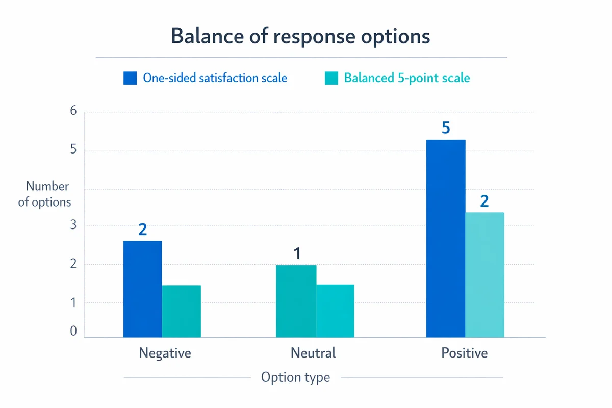
| One-sided answer list | "How satisfied are you?" with only positive options | Equal numbers of negative and positive options |
| Assumed behavior | "How do you use the reporting tab?" | "Have you used the reporting tab in the past 30 days?" |
Bias also arrives from the respondent, not just the wording. Three habits do most of the damage. Social desirability is answering the way that looks better. Acquiescence is agreeing whatever the statement happens to say. Satisficing is doing just enough work to produce an answer that will pass, rather than one that is accurate. Our guide to response bias covers all three.
Step 6. Order the items, then write a short introduction
Order is not cosmetic. An earlier question can change the answer to a later one, and the effect is measurable. Support for legal agreements for same-sex couples was 45 percent when the item followed a question about marriage, and 37 percent when it stood alone.9 Nothing about the item changed except what came before it.
A sequence that works
Screener
Confirm the person is eligible before you ask them anything else. Route everyone else straight out.
Warm-up
Easy, factual items that show the questionnaire is about something they recognize.
Core blocks
Group by topic. Keep the scale the same inside a block so nobody has to relearn it.
Diagnostics
The reasons and obstacles that explain the ratings above them.
Sensitive items and segments
Last, and only the ones you will actually use. See demographic questions for the wording patterns.
Close
One open "anything else" box, then a thank you and what happens next.
An introduction you can copy
Keep it to five lines. People came to answer, not to read.
Purpose: We are collecting feedback to improve [process or service].
Time: About [X] minutes.
Privacy: Your answers are [anonymous or confidential], and [who] will see the results.
Voluntary: You can skip any question.
Contact: Questions? [name and email].
Be careful with the time estimate, because it changes who takes part. When the same questionnaire was announced as 10, 20 or 30 minutes long, the share of people who started fell from 75 to 64.9 to 62.4 percent, and the share of starters who finished fell from 68.2 to 56.8 to 46.8 percent.10 Stating a length is the right thing to do. Just make sure the number is one your pretest produced.
Say plainly who sees the raw answers and how long you keep them, and make sure that matches your actual privacy commitments. Consent and clarity about purpose are part of questionnaire development, not paperwork bolted on afterwards.17
Step 7. Pretest with people, pilot with data, then launch
This is where questionnaires actually improve. A pretest tells you what people think the item means. A pilot tells you what the data looks like when they answer it. They are different jobs and you need both.16, 19 Build the pilot in our free survey maker and test the question order, answer options and branching on a phone before sharing it with your full sample.
Read it aloud
Ask someone to read each item out loud. Anything they stumble over, re-read, or rephrase is a rewrite candidate.
Probe the meaning
Ask "what does this question mean to you?" and "how did you land on that answer?" You are testing comprehension, not opinion.
Time it
Record how long it really takes. That number goes in your introduction, and it is usually longer than you guessed.
Rewrite and go again
One round is rarely enough on a new instrument. Fix, then test the fixes on someone new.
How many pretest interviews
More than you think. Modeling of cognitive interview pretesting found that real question problems kept surfacing as the number of interviews grew, with no clean plateau where you can safely stop.14 Treat any fixed number as a budget, not as coverage, and spend it on people who resemble your actual respondents.
What the pilot is for
- Option coverage. If "Other" or "Prefer not to say" is popular, your list is missing something.
- Scale use. Answers piled at one end usually mean the wording pushed them there.
- Straightlining. Identical answers down a whole block. In panel data it runs from 15 to 40 percent on blocks where it is a plausible pattern, and under 2 percent where it is not.13
- Logic. Confirm people only see the follow-ups that apply to them.
- Drop-off point. Note the item where people leave. That item is usually the problem, not the length.
These are two different numbers answering two different questions, and treating one as the other is a common and costly mistake. Thirty people is enough to expose a broken option list, a stem nobody reads the same way, or a logic branch that never fires. That is all a pilot is for. It is nowhere near enough to estimate a percentage, or to tell two groups apart with any confidence. Fix the instrument with the pilot, then size the real study separately with our sample size guide.
Plan for a modest response rate when you do launch: for non-probability online panels, rates of 10 percent or lower are now common.21
A worked example: one questionnaire, built through all seven steps
Every guide on this subject shows single questions being fixed. Almost none shows one questionnaire being built. So here is a full one, from the decision at the top to the instrument at the bottom, using the steps above in order.
An operations team of about 40 people did a two-day safety training in May. Management has to choose the format for the next round, and nobody has data. That is the whole brief. Now work the steps.
| Step | What it produced here |
|---|---|
| 1. Decisions first | Three decisions: keep the two-day format or move to short online sessions; which module to rewrite first; whether the material is being used on the job at all. Everything below traces to one of these. |
| 2. Items and formats | Nine items. Two closed counts, two labeled ratings, three single-choice lists, one targeted open box, one closing open box. One screener at the top. |
| 3. Answerable wording | Every behavior item got a named window ("in the 30 days since the training"). "The checklist" is defined in the stem rather than assumed. |
| 4. Options and scales | Counts use ranges that do not overlap. Both ratings use the same five points in the same direction. "I have not used it yet" is separate from the midpoint. |
| 5. Remove the steer | "How useful was the excellent new checklist" became "How useful or not useful". The format item offers both options plus "either" and "neither", so it does not push a preferred answer. |
| 6. Order and intro | Screener, then behavior, then ratings, then the format decision, then the barrier, then shift, then the open close. Shift is near the end because it is the only item people may not want to answer. |
| 7. Pretest and pilot | Read aloud with four people. Two read "the checklist" as a different document, so Q2 gained the words "the one-page checklist from Module 2". That single fix is the whole argument for step 7. |
The finished questionnaire
Nine items and a screener. Copy it, then change the nouns. Do not copy the timing estimate: get that from your own read-aloud.
Post-training questionnaire: 10 items
- Q0. Did you attend the safety training on 12 and 13 May? Single choice, screenerA screener, not a warm-up. Anyone answering "No" should be routed straight to the end. Without this you cannot tell a non-attender from an unhappy attender.
- Q1. In the 30 days since the training, how many times did you use the one-page checklist from Module 2 on a real job? Single choice, countsA named window and a named document. The ranges do not overlap, so a person who used it three times has exactly one place to go. This item answers decision three on its own.
- Q2. How easy or difficult was the checklist to use on a real job? Five-point rating, fully labeled1Very difficult2345Very easyBoth directions are in the stem, so nothing is being suggested. "I have not used it yet" sits outside the scale rather than inside it, so people who cannot judge do not get counted as neutral.
- Q3. Which part of the training was hardest to follow? Single choice, with an escapeThis one answers decision two. "Nothing was hard to follow" matters as much as the modules: without it, everyone is forced to name a problem that may not exist.
- Q4. What made that part hard to follow? Open text, shown only if a module was chosen at Q3Short answerThe one open item that earns its place. It is targeted at a specific answer, it is skipped for most people, and it is the only thing that will tell you how to rewrite the module.
- Q5. If the same training ran again, which format would let you attend all of it? Single choice, balancedThe decision item. It asks about attendance, which people can answer, rather than preference, which invites a guess. "Either" and "neither" are both real answers and both are actionable.
- Q6. What would make it hard for you to attend? Select all that apply. Multiple choice, with an escapeSelect-all costs effort, so use it sparingly. It is justified here because the barriers stack: someone can face two at once, and forcing one answer would hide that.
- Q7. How likely or unlikely are you to recommend this training to someone on your team? Five-point rating, same scale as Q21Very unlikely2345Very likelySame five points, same direction as Q2. Reusing one scale means nobody has to relearn it, and the two items can sit side by side in the same chart.
- Q8. Which shift do you usually work? Single choice, placed lateNear the end, because it is the only item people might not want to answer. It is here only because the analysis plan compares shifts. If it did not, it would be cut.
- Q9. Anything else we should know before we choose the format? Open text, optionalOptionalThe closing box. It catches what the option lists missed, and it is the cheapest early warning you will get about a question you should have asked.
The answer options above are shown, not clickable. They are a picture of the instrument, not a working form. Nothing here collects anything. Printing drops the notes and gives you the ten items on their own, so your browser's "save as PDF" turns this into a document you can hand round.
This instrument was written for the example above. If you would rather not start from a blank page, you can start from an existing template and change the items to fit your own decisions.
Check an item you have already written
Paste a question you are working on. This runs the same checks the steps above describe, and tells you which ones it trips. It is a checklist, not a verdict: it reads patterns in the words, it cannot read your intent, and a flagged item is sometimes the right item.
Design for the analysis file, not for the slide
This constraint applies at every step, which is why it is not one of the seven. A questionnaire is also a data specification. If the answers cannot be counted cleanly, you have bought yourself weeks of tidying and a number you cannot defend.
- One construct per column. If you care about speed and about accuracy, measure them with two items. Merged constructs cannot be unmerged later.
- Standardize the time windows. Mixing "last week" in one item and "last year" in the next makes the two impossible to put on the same chart.
- Pre-code anything you will group by. Free-text department names arrive as forty spellings of six departments. Give a list.
- Decide what missing means before you launch. Skipped, "prefer not to say", and "not applicable" are three different things, and they need three different codes.
Plan the comparisons and the precision at the same time. Even a perfect instrument cannot rescue a study that collected too few answers to tell two groups apart, which is a sample size question, and the point at which a difference counts as real is a statistical significance question.
Design for mobile, not for the laptop you built it on
The second cross-cutting constraint. Assume a phone, on a mobile connection, with an interruption halfway through.
Phones are slower than desktops for the same instrument. In a crossover experiment where the same people answered on both devices, the median completion time was 17.7 minutes on a smartphone against 10.5 minutes on a PC.11 That is 69 percent longer for identical content, so a questionnaire timed on a laptop is being timed on the wrong device.
The reflexive assumption that phone answers are worse is only partly true, and it is worth being accurate about. One direct comparison found that mobile respondents wrote shorter open answers and skipped more items, but that PC respondents were the ones who straightlined more through grid questions.12 The phone problem is effort and interruption, not carelessness.
- Break up the grids. A wide matrix on a small screen is the single worst pattern available, and it is where straightlining lives.
- Keep options short enough not to wrap. Options that run to two lines stop being comparable at a glance.
- Show follow-ups only when they apply. Skip logic removes more perceived length than cutting items does.
- Make the tap targets generous. Radio buttons with real spacing between them, not a dense stack.
- Use a progress bar only if it is honest. A bar that jumps backwards because of skip logic is worse than no bar.
Is a questionnaire qualitative or quantitative?
Both, depending on what you put in it. The instrument is not the method. A questionnaire made of closed items with fixed options produces quantitative data. One made of open prompts produces qualitative data. Most real instruments do some of each, and the mistake is not choosing, it is not deciding.
| Design choice | Quantitative aim | Qualitative aim |
|---|---|---|
| What you are after | How much, how many, how it differs between groups | Why, in whose words, and what you did not think to ask |
| Items | Mostly closed, formats fixed in advance | Mostly open prompts with follow-ups |
| Wording rule | Identical for everyone, no exceptions | Consistent, but a prompt may invite elaboration |
| How many people | Enough for the comparisons you plan to make | Enough that new answers stop adding new themes |
| What comes out | Counts, percentages, differences between groups | Coded themes, quotations, hypotheses to test next |
| The main risk | Precise answers to a badly worded question | Rich answers you have no consistent way to code |
For a research project, the mixed shape is usually the right one: a small set of closed items that carry the measurement, and one or two open prompts that explain the numbers. The step that changes most is step 2, because open answers need a coding scheme, and coding schemes need more than one coder before anyone should trust them.1 If you are choosing the study shape rather than the items, that decision belongs one level up, in survey research design.
Which rules are proven, and which are just repeated
Questionnaire advice gets copied from page to page until every rule sounds equally settled. It is not. Some of these rules rest on decades of split-sample experiments. Others rest on one recent study, and a few of the numbers in wide circulation rest on nothing at all. Here is where each claim on this page actually stands.
| Claim | The number | Grade | Source |
|---|---|---|---|
| Wording changes the result | 65.2% vs 19.8% said "too little" is spent, for the same programs labeled "assistance to the poor" or "welfare" | A | Rasinski 1989; Smith 19872, 3 |
| Framing changes the result | 68% vs 43% support, with and without a casualties clause | A | Pew Research Center8 |
| Order changes the result | 45% vs 37% support, same item, different position | A | Pew Research Center 20039 |
| Item-specific options beat agree or disagree | Reliability 0.87 to 0.93 vs 0.36 to 0.73 | A | Saris and colleagues 20104 |
| Stated length changes participation | Completion among starters fell 68.2% to 56.8% to 46.8% at 10, 20 and 30 stated minutes | A | Galesic and Bosnjak 200910 |
| An offered "don't know" gets taken | 15% chose it; only 3% and 4% skipped comparable items without it | A | Gilljam and Granberg 19937 |
| Phones take longer | 17.7 vs 10.5 median minutes, same people, both devices | A | Antoun and colleagues 201711 |
| Five to seven scale points | Indices rise to about 7 points, then flatten; reliability drops again past 10 | B | Preston and Colman 20005, 1 |
| A "don't know" option pulls people off the midpoint | Midpoint choice fell by about 7 to 17 points | B | Wetzelhutter 20206 |
| Straightlining is common where it is plausible | 15% to 40% on plausible blocks, under 2% elsewhere | B | Schonlau and Toepoel 201513 |
| Phone answers are not simply worse | Shorter open answers on mobile, but more straightlining on PC | B | Mavletova 201312 |
| Split double-barreled items | No clean percentage; the two versions failed to measure the same thing | B | Menold 202015 |
| Pretesting has no safe stopping point | Problems kept appearing as interview counts rose | B | Blair and Conrad 201114 |
Grades mean: A replicated experiment or a literature-wide synthesis. B one strong study. C widely repeated but contested or untraceable, which is why nothing on this page carries one.
Numbers we deliberately did not use
Each of these is common in questionnaire advice. We chased every one of them to a source and left them out.
"Attention spans are now 8 seconds, shorter than a goldfish"
Traces to a 2015 marketing report citing a content-mill site whose own sources could not be produced when journalists asked.24 The goldfish comparison is invented too.
"Five to seven pretest interviews catch 75 to 85 percent of problems"
This is a usability-testing result about software bugs22 that got transplanted onto cognitive interviewing. The actual survey study found no such plateau.14
"The average survey response rate is [pick a number]"
At least four incompatible figures circulate, each with a different hidden definition of who was asked. Grounded ranges by sample type exist instead.21
"Keep it under 10 minutes or you lose people"
The direction is right, the cliff is not. The measured curve is a steady slope from 10 to 30 stated minutes, with no threshold.10
"Seven plus or minus two, so use a 7-point scale"
Miller's 1956 paper is about short-term memory for lists, not about how many points a person can tell apart on a scale.23 The real scale-points evidence gets you to five to seven anyway.5
"Double-barreled questions ruin your data"
Sound rule, thin evidence. We could find one dedicated randomized test of it, against dozens for wording and order effects.15 We say so in step 3 rather than overclaiming.
Edge cases that quietly break questionnaires
Sensitive items
Income, health, performance problems, and anything a manager might read. These raise both break-offs and misreporting when trust is low. Put them late, say in one line why you are asking, and offer a real way to decline. "Prefer not to say" is data. A blank is not.
"Not applicable" is not "neutral"
Do not let people who cannot judge land in the middle of your scale. Give them a separate option outside the scale, or route them past the item with skip logic. Otherwise your average moves for a reason that has nothing to do with opinion.
Order effects inside a long list
Options near the top of a long list get chosen more often on screen. Randomize the order of brands, reasons and issues, and hold the order fixed only where it means something, such as a frequency ladder or a set of dates.
Negations
"Do you agree that onboarding is not difficult?" forces the reader to resolve two negatives before they can answer. Write the positive version and let the scale carry the direction.
Translation
Avoid idiom, sport metaphors and local shorthand, because they do not survive translation and they exclude readers who work in your language as a second one. If you translate, use back-translation, and have it reviewed by someone who knows the subject and not only the language.
Repeat waves
If you plan to compare this round with the next one, freeze the wording now. Improving an item between waves means the change you measure may be your own edit. Keep the old wording, add the better one alongside it for one wave, then switch.
The review checklist, before you send anything
Questionnaire review checklist
- Decisions. Every item traces to a decision you wrote down in step 1.
- Formats. Each item's format was chosen for the output it feeds, not out of habit.
- Windows. Every behavior item names a time period, and the period suits the behavior.
- Terms. Jargon is defined in the stem. Acronyms are spelled out once.
- One idea. No item hides two attributes, two objects or two time frames.
- Options. Ranges do not overlap, the list covers realistic answers, and there is an escape.
- Scales. Same points, same direction, labeled, with "not applicable" kept outside the scale.
- Neutral wording. No adjectives in the stem, and both directions offered.
- Order. Screener first, sensitive items late, one scale per block.
- Introduction. Purpose, honest timing, privacy, voluntary, contact. Five lines.
- Phone. Opened on a real phone, no wide grids, no wrapping options.
- Read-aloud. Someone outside the project read every item and understood each one as intended.
- Timing. The number in your introduction came from that read-aloud, not from a guess.
- Codes. Skipped, declined and not applicable have three separate codes.
Frequently asked questions
What is the first step in designing a questionnaire?
Writing down the decisions the results have to support. Not the topic, the decisions. Until you can say what you will do differently depending on the answers, you have no way to tell a necessary item from an optional one, and the draft grows until somebody gets bored of it.
What is the difference between a questionnaire and a survey?
The questionnaire is the instrument: the list of items and their answer options. The survey is the whole study around it, including who you ask, how you reach them, how many you need, and what you do with the results. You can run one survey with several questionnaires, and the same questionnaire in several surveys.
How many questions should a questionnaire have?
As few as your decisions require. Chasing a target number is the wrong move; aim at a completion time instead, and get that time from your own read-aloud rather than a rule of thumb. Stated length affects who takes part: in a controlled experiment, completion among people who started fell from 68.2 percent at a stated 10 minutes to 46.8 percent at a stated 30 minutes.
How long should a questionnaire take to complete?
Short enough that the stated time does not put people off, and honest enough that it matches reality. There is no cliff edge at any particular minute. The measured relationship is a steady decline in participation as stated length rises, so every item you keep costs you a little response, and you should be able to name what each one buys.
Is a questionnaire qualitative or quantitative?
It can be either, and most are a bit of both. Closed items with fixed options produce quantitative data. Open prompts produce qualitative data. What matters is deciding which one an item is for before you write it, because the two need different wording rules, different numbers of respondents, and completely different analysis.
Should I include a neutral midpoint on a rating scale?
Include one when "neutral" is a genuine position on the thing you are measuring. Removing it does not force out a hidden opinion; people pick more or less at random among the points nearest the middle. Also decide about the midpoint and a "don't know" option together, because offering a "don't know" cuts midpoint use by roughly 7 to 17 percentage points.
When should I offer a "Don't know" option?
When the respondent may genuinely not have the information, such as a plan name, a date, or a technical detail. Avoid it on questions about their own experience, where nearly everyone can answer. An easy exit gets taken: on one attitude item 15 percent chose "don't know" when it was offered, while only 3 to 4 percent skipped comparable items that did not offer it.
How many open-ended questions should I use?
One or two, placed where they will earn their keep, usually as a follow-up to a specific closed answer and as a closing catch-all. Open answers are the only way to hear what your option list forgot, but they need a coding scheme and more than one coder before the results mean anything, and that cost is real.
How do you test a questionnaire before sending it?
In two passes. A pretest checks comprehension: have people read each item aloud and tell you what they think it means and how they picked their answer. A pilot is a small live run that checks the data: drop-off points, option coverage, scale behavior, and whether your planned analysis actually works. Do the pretest first, because it is the one that changes the wording.
What type of research design uses a questionnaire?
A questionnaire is a data collection instrument, not a design, so it appears across several designs. Cross-sectional studies use one at a single point in time. Trend and panel studies repeat one over time. Experiments use one to measure outcomes after a manipulation. Choosing among those is a study-design decision that sits one level above the wording of the items.
How do you validate a questionnaire?
A few new items measuring something concrete need pretesting, not psychometric validation. A scale meant to measure something abstract, and to be compared across groups or reused by other people, needs more: expert review of content, a pilot large enough to check that the items hold together, and evidence that scores relate to something external in the way you predicted. If a validated instrument already exists for your construct, use it rather than writing your own.
How this guide was put together, and what it does not cover
The seven-step sequence follows the development process described in the questionnaire methodology literature16, 17, 18, 20 rather than any single vendor's framework. Every number quoted on this page comes from a published experiment or an official methodological report, listed below. Each one was graded before use, and the grade is shown next to the claim in the evidence table.
Claims that we could not trace to a primary source were left out, and the most common of those are named in "numbers we deliberately did not use" so that you can recognize them elsewhere. Where a rule is sound but the direct evidence is thin, such as splitting double-barreled items, the page says so instead of borrowing confidence from a stronger finding.
Most of the experimental evidence here comes from surveys run in the United States and Western Europe, largely on general-population and web-panel samples. Effect sizes for wording and order will not transfer unchanged to every language, subject or population, and none of it was tested on your respondents. Treat the numbers as evidence that these effects are real and can be large, not as constants you can plug in.
The worked example is a constructed case built to show all seven steps in one place. It is not a report of a real study, and the pretest described in it is illustrative.
This page covers the instrument. It does not cover who to ask, how many to ask, or how to analyze what comes back. Those are separate jobs, covered in sampling, sample size and statistical significance.
SuperSurvey makes survey software, so we have a commercial interest in people running surveys. This guide is free to read, and its advice applies to any survey platform. The item checker runs entirely in your browser and sends nothing anywhere. Links to our builder and template library offer ways to put the questionnaire into practice.
References
- Krosnick, J. A., & Presser, S. (2010). Question and questionnaire design. In P. V. Marsden & J. D. Wright (Eds.), Handbook of Survey Research (2nd ed., ch. 9). Emerald.
- Rasinski, K. A. (1989). The effect of question wording on public support for government spending. Public Opinion Quarterly, 53(3), 388-394. doi.org/10.1086/269158
- Smith, T. W. (1987). That which we call welfare by any other name would smell sweeter. Public Opinion Quarterly, 51(1), 75-83. doi.org/10.1086/269015
- Saris, W. E., Revilla, M., Krosnick, J. A., & Shaeffer, E. M. (2010). Comparing questions with agree/disagree response options to questions with item-specific response options. Survey Research Methods, 4(1), 61-79. doi.org/10.18148/srm/2010.v4i1.2682
- Preston, C. C., & Colman, A. M. (2000). Optimal number of response categories in rating scales. Acta Psychologica, 104(1), 1-15. doi.org/10.1016/S0001-6918(99)00050-5
- Wetzelhutter, D. (2020). Scale-sensitive response behavior: consequences of offering versus omitting a "don't know" option and/or a middle category. Survey Practice, 13(1). doi.org/10.29115/SP-2020-0012
- Gilljam, M., & Granberg, D. (1993). Should we take don't know for an answer? Public Opinion Quarterly, 57(3), 348-357. doi.org/10.1086/269380
- Pew Research Center. Writing survey questions. Methods explainer. pewresearch.org/writing-survey-questions
- Pew Research Center (2003, November 18). Religious beliefs underpin opposition to homosexuality, Part 2: Gay marriage. pewresearch.org/politics/2003/11/18/part-2-gay-marriage
- Galesic, M., & Bosnjak, M. (2009). Effects of questionnaire length on participation and indicators of response quality in a web survey. Public Opinion Quarterly, 73(2), 349-360. doi.org/10.1093/poq/nfp031
- Antoun, C., Couper, M. P., & Conrad, F. G. (2017). Effects of mobile versus PC web on survey response quality. Public Opinion Quarterly, 81(S1), 280-306. doi.org/10.1093/poq/nfw088
- Mavletova, A. (2013). Data quality in PC and mobile web surveys. Social Science Computer Review, 31(6), 725-743. doi.org/10.1177/0894439313485201
- Schonlau, M., & Toepoel, V. (2015). Straightlining in web survey panels over time. Survey Research Methods, 9(2), 125-137. doi.org/10.18148/srm/2015.v9i2.6128
- Blair, J., & Conrad, F. G. (2011). Sample size for cognitive interview pretesting. Public Opinion Quarterly, 75(4), 636-658. doi.org/10.1093/poq/nfr035
- Menold, N. (2020). Double barreled questions: an analysis of the similarity of elements and effects on measurement quality. Journal of Official Statistics, 36(4), 855-886. doi.org/10.2478/jos-2020-0041
- Rattray, J., & Jones, M. C. (2007). Essential elements of questionnaire design and development. Journal of Clinical Nursing, 16(2), 234-243. doi.org/10.1111/j.1365-2702.2006.01573.x
- Boparai, J. K., Singh, S., & Kathuria, P. (2019). How to design and validate a questionnaire: a guide. Current Clinical Pharmacology, 13(4), 210-215. doi.org/10.2174/1574884713666180807151328
- Slattery, E. L., Voelker, C. C. J., Nussenbaum, B., Rich, J. T., Paniello, R. C., & Neely, J. G. (2011). A practical guide to surveys and questionnaires. Otolaryngology-Head and Neck Surgery, 144(6), 831-837. doi.org/10.1177/0194599811399724
- Edwards, P. (2010). Questionnaires in clinical trials: guidelines for optimal design and administration. Trials, 11, 2. doi.org/10.1186/1745-6215-11-2
- Stone, D. H. (1993). Design a questionnaire. BMJ, 307(6914), 1264-1266. pmc.ncbi.nlm.nih.gov/articles/PMC1679392
- American Association for Public Opinion Research (2022). Data quality metrics for online samples: considerations for study design and analysis. Task force report. aapor.org task force report (PDF)
- Nielsen, J., & Landauer, T. K. (1993). A mathematical model of the finding of usability problems. Proceedings of ACM INTERCHI '93, 206-213. doi.org/10.1145/169059.169166
- Miller, G. A. (1956). The magical number seven, plus or minus two. Psychological Review, 63(2), 81-97. doi.org/10.1037/h0043158
- Maybin, S. (2017, March 10). Busting the attention span myth. BBC News. bbc.com/news/health-38896790
Every DOI above was checked against the DOI resolver, and every link was checked for a live response, on 21 August 2026.